Partying like it was 1999, I was working with Microsoft Site Server, analyzing web logs in multiple dimensions for the largest telecom company in Canada. Standard dimensions for a web log would include host, referrer, uri, date, time, code, client ip, browser, and the mess that was cookies and session ids, One tool that sticks out for me was Microsoft Site Analyzer. It was the coolest tool I had seen (out of Microsoft, at least) for visually understanding path analysis and links within a web site.
A huuuuge list of links to Neural network resources, published in 1999.
The interactivity of the tool and bouncing, spiderweb physics really made the it fun to use. Though it didn't scale so well once we got up to 50,000 pages of content and 10GB of web logs a day... and I think I was the only one actually using it. Most of the e-marketers were just concerned with how many visits there were to their respective campaign pages, and less concerned with what page links to where or how people got to a page in the site.

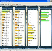
Microsoft Data Analyzer was another tool for visualizing multiple dimensions that didn't really take off as well as the Proclarity's and Cognos BI tools of the world.
Dollar Street, the latest tool from GapMinder, uses 30,000 photos, from 240 families in 46 countries (excluding Canada) and the stories of families, their annual income, and the dimensionality of their lives, including what toys they have and how they brush their teeth.
Toys on different incomes
It is a great example of the power of data combined with multiple dimensions of visual imagery, personal stories, and heart-breaking reality. The story, context and imagery behind the data points is much more important than just the numbers themselves or plots on a graph.
What does it mean to think in 4-dimensions?
For a more lighthearted example of a different way of visualizing 3-D data, here's Wolfenstein 1-D, Wolfenstein in a single pixel line. Not as good as Snake... or this Deep Reinforcement Model which beats Snake.
In the 90's, John Carmack of id, Wolfenstein and now Oculus Rift fame put together a side-scroller called Dangerous Dave, to clone Nintendo's Super Mario Bros for the PC. At the time it was amazing.
Now we are in 2017, and we have Nintendo releasing Super Mario Run, a mobile side scroller that does the side scrolling for you. And it's amazing? Nostalgia sells, just ask Pokemon Go players.
People tend to avoid eye contact when speaking, as their thoughts and verbal responses are more easily processed when not distracted by the visualization process. This may explain the overwhelming feeling you may get when viewing something the brain cannot easily process, such as a multi-dimensional Virtual Reality video that shouldn't exist in your current reality space.
It may also explain why it's still fun to ignore having to move a character in multiple dimensions and just tap a screen like a slot machine while hurling uncontrollably right and jumping on Koopa Troopas and Goombas.
And why the 8 bit workshop Atari 2600 repl is Amazing.
Deep Learning with AtariThis is amazing! Zero friction interface. https://t.co/y91kss0QM7— John Carmack (@ID_AA_Carmack) December 31, 2016